

If you’ve been reading here for any length of time, you know that I am a total homebody at heart. Sure, I travel a lot, and have events and things I need to attend for work, but nothing is better than being at home. I’ve worked really hard to make my space feel cozy, thoughtful, and curated. One of my favorite ways to add a bit of personality to a room is through a good gallery wall. Especially when there’s a big, blank wall staring back at you! When I moved into my house a few years ago, I just knew that the larger wall opposite my dining table would be the perfect place to create one.
The best gallery walls (in my opinion) feel layered. A mix of photos, prints, maybe a mirror or (framed) found object or two. As I entertain regularly and film downstairs a lot, I generally keep my family photos upstairs and leave downstairs for my art, but you can mix it up. You can hang anything you love. Art, travel snapshots, pressed flowers, handwritten notes . . . whatever you want! I remember going to the Framebridge store in Brooklyn years ago and seeing all of the things they could frame. It blew my mind!
If you are not sure where to start, I get it. A big empty wall can feel really intimidating. When I moved into my house, I had a friend with a good eye help me get started. I promise, it’s way easier than it looks. If you need a starting point, you are in the right place. Today, I’m sharing my favorite tips, a few layout ideas, and plenty of inspiration to help you create a gallery wall that feels like you.
How to Create a Gallery Wall That Feels Collected, Not Cluttered
Creating a gallery wall can definitely feel a little overwhelming when first approaching the idea. You’re looking at a blank space, maybe a collection of your favorite art pieces, and suddenly it’s like… where do I even begin?
I have been there. I had multiple friends help me with my gallery wall. It was super intimidating at first, but it all came together, and I’m still adding to it! By the end of this post, you’ll have all my favorite tips and tricks for putting together a gallery wall. One that’s not only beautiful but also adds depth, personality, and a little bit of storytelling to your space.
A little intention goes a long way, even more so when you’re aiming to achieve cohesion and visual appeal. But first, if you’re totally new to the concept, let’s talk about it. What exactly is a gallery wall? And what’s the best method for creating one?
What Is a Gallery Wall?
A gallery wall is basically your own little art show, except it’s in your living room instead of behind glass at a museum.
It’s a curated mix of framed art, photos, and maybe even a few unexpected treasures (hello, vintage home finds!). Alone, each piece of art adds a little personality. But when combined, they work together to tell a visual story. It can be a travel photo you love or an abstract wall art print that just feels like you. Or maybe a sweet painting passed down from a loved one.
What makes a gallery wall really shine isn’t just the pieces themselves. It’s how they play together. The mix of sizes, the varied frames, the way you space things, the colors and textures. It’s all about creating a layout that feels intentional, but never too perfect. My own gallery wall is colorful chaos, and I love it that way.
Ultimately, gallery walls are one of my favorite ways to add personality to a room. They feel like the missing piece that brings a lived-in, collected-over-time vibe that truly makes a space feel like home.
Are Gallery Walls Still in Style?
Gallery walls aren’t going anywhere. They just evolve with the times!
Maybe your first version was a bedroom wall covered in magazine clippings (guilty), or your parents had one packed with family photos in mismatched frames. These days, gallery walls have taken on a more curated, thoughtful feel.
You’ll see more variety now: mixed materials, bold art prints, layered textures, and fewer strict rules about symmetry. Some lean fully into wall art, others are photo-heavy with a modern twist, and some mix in sculptural pieces, like mirrors, shelves, plates, or candle sconces. The beauty of it? You get to choose.
Trends are fun for inspiration, but when you hang a gallery wall, it doesn’t have to look like something out of Architectural Digest. Unless that’s the vibe you’re going for, of course. This is your space, your style, your story. Fill it with whatever makes you happy.
How to Make a Gallery Wall
Choose the right wall.
Picking the right spot for your gallery wall is kind of like choosing the perfect backdrop for a favorite photo. It should highlight the moment, not compete with it.
Take a little walk around your home and notice where your eye naturally lands. Some walls just feel like they’re meant for something special—usually ones that aren’t too busy with furniture or pre-placed decor. In the living room, it might be the blank space above the sofa. In the dining room, it could be the wall you face during meals—perfect for sparking dinner party conversation.
You’re looking for wall spaces with enough room for your pieces to breathe, but not so massive that your arrangement feels dwarfed. Ideally, it’s somewhere you see often. Your gallery wall should greet you daily, reminding you of your favorite memories, moments, and little pieces of beauty that make your home yours. I sit at my dining table every day to work and my gallery wall keeps me company.
Pick your “vibe.” This is important! Before you pick up a hammer, take a minute to think about the gallery wall feeling you want it to give off. It’s kind of like setting the mood for a dinner party: every little detail adds up to the full experience.
Are you going for a clean, modern feel with matching frames and black-and-white photos? Or do you love the look of something more layered and lived-in? Think mismatched frames, textured pieces, and art that feels like it’s been collected over time.
That overall feeling is what is going to guide you. It will tell you what colors to bring in, how closely everything should be spaced, and the types of pieces you could include. Once you know the mood, the rest falls into place. Your wall will feel just like you: intentional, personal, and full of charm.
Lay it out before committing.
Before you start hanging anything, take a little time to map out your vision. I like to clear a section of the floor or a big table and lay everything out. Frames, art, maybe a unique object or two, like a mirror or round painting. If you are feeling particularly ambitious, I recommend buying some craft paper and recreating the shapes of your different art pieces. Hang those up first to get an idea for how everything will look. This is your no-pressure moment to play around with layout and spacing without putting any holes in the wall yet.
Try moving things around, mixing up the shapes, and stepping back to see how everything looks together. You might be surprised. Something you thought would go front and center could look even better off to the side. Or a tiny piece might shine more when it’s next to something oversized.
Keep tweaking until it feels balanced and cohesive. That way, when it’s time to hang it all up, you’ll already have a plan. No accidental holes, no “I don’t love this but I already hung it up” feeling—it will look perfectly intentional.
Set the center at eye level.
One of the easiest ways to make your gallery wall feel balanced? Start by placing the center at eye level. The magic number is to have the center of the art piece be around 57 inches from the floor. This is where artwork tends to feel the most natural and inviting when you walk into a room. It’s also where most people’s eyes tend to focus first.
This simple trick helps anchor the entire gallery wall arrangement. It doesn’t matter if you’re hanging a few small prints or going with lots of larger pieces. This is particularly helpful if you’re working with larger frames. If you hang them too high, things can feel a little disconnected from the rest of your space. At the same time, if they’re too low, things might start to feel cramped.
Keeping that midpoint at eye level gives everything a sense of flow. It makes your artwork feel like it belongs—enhancing the space rather than pulling focus.
Mix sizes and orientations strategically.
Mixing frame styles, sizes, and orientations is one of my favorite ways to bring movement and personality to a gallery wall. At the same time, thoughtful placement matters. For example, I like to begin with the largest pieces first. They act as grounding elements and give the whole arrangement structure. To start, try placing them near the center (or just off-center) to naturally draw the eye.
Then build around them with medium and smaller frames to keep things balanced. Playing with both vertical and horizontal pieces adds visual interest—just be mindful of how the edges line up! Clean lines keep the whole display feeling cohesive.
Think of it like styling an outfit. The larger pieces are your staples (like a blazer or maxi skirt). The foundations! The smaller ones are your accessories; they add style and seem to pull everything together. The key is balance and proportion; every piece should feel like it has a place.
Keep 2-3-inch spaces between pieces.
When it comes to hanging the art on a gallery wall, the space between your pieces matters just as much as the art itself. I always aim for 2-3 inches between frames. It gives everything room to breathe while still feeling cohesive.
Too much space, and things can start to feel scattered or disjointed. Too little, and it reads as cluttered. But that sweet spot of consistent spacing? It’s the invisible glue that holds the whole arrangement together. Just a few inches of space can turn a handful of frames into something that looks polished and curated.
Add dimension.
Adding dimension to a gallery wall is what really makes it come alive. Flat frames are beautiful, of course, but mixing in pieces with texture and depth gives the whole display that extra bit of personality. (Like this sculpted frame.) Think a tiny floating shelf with a trailing plant, a vintage mirror that catches the light just right, or even a small sculptural piece to break up all the rectangles.
This kind of layering draws you in. It’s not just pretty to look at, it makes you feel something. A little texture adds warmth, a reflective surface adds light, and the varying depths create subtle shadows that shift throughout the day. It turns your gallery wall into more than just a collection. It becomes a space with movement, charm, and a whole lot of you.
Don’t shy away from asymmetry.
Asymmetry in a gallery wall is one of those little reminders that imperfect is good! You don’t need a neatly spaced grid for your wall to feel curated. In fact, I love when things are a bit off-center. It makes everything feel more collected and relaxed.
Start with one or two standout pieces—like maybe your biggest frame or something with bold color. Then just build around it and let the rest of the pieces flow naturally! Instead of matching things up perfectly, focus on visual balance. It’s less about measuring and more about trusting your eye.
Add some extra lighting for ambiance.
Ready to get a little more advanced? Add a little extra lighting to your gallery wall. It will take it from charming to captivating. Whether it’s a sleek picture light, a pair of chic sconces, or even some subtle track lighting, the right glow can bring out texture, deepen color, and make every detail pop.
Just be sure to steer clear of anything too harsh. Cool-toned or overly bright bulbs can wash out your art or create a distracting glare on glass. Instead, look for soft, warm lighting and position it so everything feels evenly lit without harsh shadows.
Gallery Wall Ideas to Test in Your Home
Minimal & Modern
A minimal, modern gallery wall is all about clean lines and quiet elegance. It’s thoughtful and calming—nothing fussy, nothing overdone. Think matching frames in matte black, soft white, or light oak, and art that leans simple. I’m talking about black-and-white photography, abstract sketches, or graphic prints.
The layout usually feels pretty balanced and symmetrical, with equal spacing between each piece to keep things looking polished. No clutter, no ornate frames, no competing colors. Just a tight, neutral palette with maybe one or two accent tones.
This kind of gallery wall shines in spaces that already have a clean, airy vibe. Like a light-filled living room with streamlined furniture, a minimalist dining area, or a home office where you want something inspiring but not distracting.
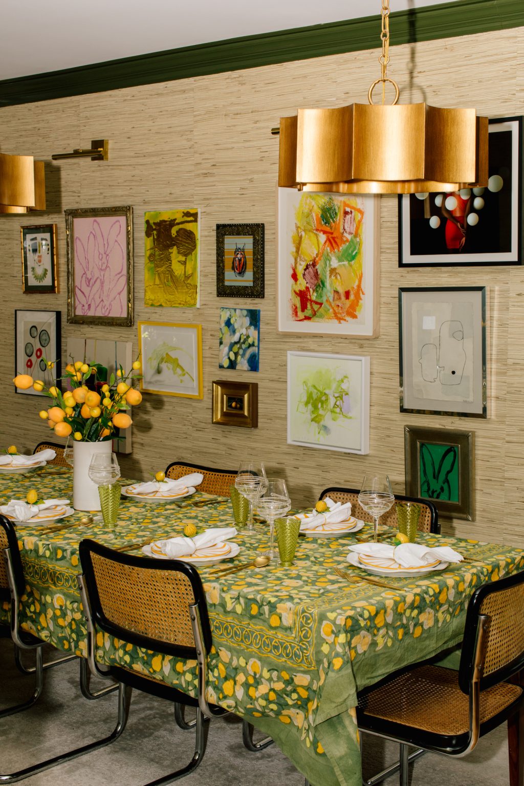
Eclectic Collected Wall
My favorite, from one of my favorite people’s (Dan Pelosi) homes. An eclectic, collected gallery wall is like a visual scrapbook. A little bit curated, a little bit sentimental, and completely one-of-a-kind. Instead of matching frames or creating perfect symmetry, it leans into the charm of variety. Think: a bold abstract next to a vintage-inspired botanical print, a candid family photo in a gold frame, or even a tiny mirror catching the light just right.
The magic is in the mix, but there’s always a unifying thread. Maybe it’s similar colors or a shared color palette, repeated materials like brass or wood, or the way everything’s spaced.
The style is especially perfect in cozy, personality-packed spaces. I’d place it in a living room layered with throws and books or a hallway that needs a little charm. Or, maybe in a dining room that could use a little color and texture. Regardless of where it goes, it’s sure to elevate and enhance any room.
Statement Anchor with Fillers
A statement anchor gallery wall is one of my favorite ways to make a bold impact without overwhelming a space. It all starts with one standout piece (your anchor!) that sets the tone for everything around it. This could be a large-scale abstract painting, a dramatic photo, or even a beautifully detailed textile. Whatever you choose, it should be the piece that instantly draws the eye and gives the wall its personality.
Then come the supporting players—the smaller “filler” pieces that enhance, not compete. These can be soft line drawings, minimalist prints, or geometric shapes that echo the tones or vibe of the anchor. The idea is to create balance, not busyness.
Keep things feeling modern by sticking to simple frames and a cohesive palette—matte black, pale wood, or soft neutrals always work beautifully. This style is lovely above a sofa or in a dining room, where the anchor helps ground the space while the rest of the wall stays airy and intentional.
Staircase Story Wall
A staircase gallery wall turns a pass-through space into something personal and special. And for whomever is walking up the stairs, it’s like they get to be told a story. The arrangement of art follows the natural rise of the steps which draws the eye upward. I like to mix frame sizes and orientations here. I am still adding art to my own staircase (it’s much smaller), but find the one above really inspiring. I love the way the art ties in with the cherry red console.
As always, what really makes it work is what’s inside the frames. Think family photos, vacation memories, or a mix of personal mementos and artwork. It’s the kind of wall that unfolds as you go, with something new to notice at every step.
To keep it from feeling too busy, I recommend tying it all together with a unifying detail. It could be matching frame finishes, a consistent color theme (like the red above!), or similar photo edits.
Monochrome Moodboard
A monochrome moodboard gallery wall is one of my favorite ways to create drama in a subtle yet impactful way. It’s all about staying within the same color family—layering tones and textures that speak the same visual language. Think soft creams against warm beige, or deep navy paired with smoky blues. The result? A gallery wall that feels effortless, pulled together, and quietly chic.
The secret is in the restraint. By keeping everything within a narrow color palette, your eye starts to notice the finer details. You’ll see the texture of a canvas, the curve of a sculptural object, or the subtle grain of a wooden frame. I love how the gallery wall above uses water and the ocean to feel cohesive (and how cool are those framed shells?).
This style is stunning in more intimate corners of the home. Cozy reading nooks, calming bedroom walls, or a serene home office work as perfect backdrops. It adds just enough visual interest without overwhelming the space.
Showcase your favorite photos, artworks, and pieces with a gallery wall in your home.
A gallery wall is one of the easiest (and most fun) ways to turn a blank wall into something beautiful. Whether it’s a favorite art print, a collection of vacation photos, or a few flea market finds… this is your chance to curate a truly personal space.
Want more style inspiration? For my own home, fashion, and everything in between, come hang out on Instagram to see what I’m up to. And join me on Substack for exclusive content you won’t find anywhere else.
A few posts from the archive that may be helpful!
Disclosure: If you buy something through my links, I may earn an affiliate commission at no cost to you. I only feature things I truly love here. Thanks for your support.